A tall mixed-use tower without parking replaces a small Philadelphia parking lot, while its multimodal urban passageway connects two streets.
Building on small infill lots in a busy downtown is a challenging task. Building on a 100-foot-wide (30 m), half-acre (0.2 ha) site between two buildings in the middle of a 400-foot-long (122 m) block magnifies the constraints. And building 322 smaller units that need light and air on a 225-foot-deep (69 m) site requiring party walls along those long property lines only increases the design challenge.
Baltimore-based Design Collective met the challenge by designing a 26-story, 300,000-square-foot (28,000 sq m) tower that achieves an urban density of 644 units per acre (1,610 per ha). The tower rises above a two-story, 35-foot-tall (11 m) podium that houses a 225-foot-long (69 m) open multimodal urban passageway connecting two streets; 7,400 square feet (688 sq m) of streetfront retail space; a 3,000-square-foot (279 sq m) indoor/outdoor fitness center in a bridge spanning the passageway; 11,000 square feet (1,000 sq m) of resident amenity spaces; and six outdoor terraces on the second, third, and 25th floors.
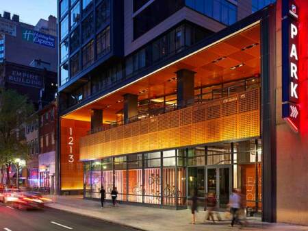
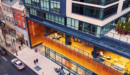
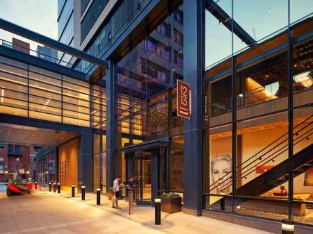
A second-level outdoor public terrace is defined by a horizontal band of perforated metal panels topped by a clear glass railing. Below that are storefronts along a 16-foot-tall (5 m) wall of floor-to-ceiling glass. The open space of the 35-foot-tall (11 m) passageway and recessed terrace opens and lightens the tower’s base. (Design Collective)
Sculpted Setbacks
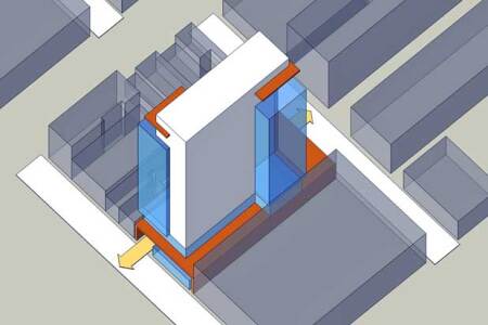
Counterintuitively, the design solution came from the team’s decision not to fill the permissible buildable envelope, but rather to sculpt setbacks enabling the tower to recede from its allowable build-to lines. Michael Goodwin, the principal-in-charge architect, notes that the team achieved this by stepping the tower back 25 feet (8 m) from both its long east and west property lines for a length of 100 feet (30 m) on each side. That permits a thin rectangular slab of apartments with floor-to-ceiling glass walls that flood the units with natural light, while eliminating the need for continuous three-hour fire walls for most of the units since they no longer straddle the property line.
Rather than designing the conventional solution of a stepped back, wedding-cake-like tower, however, Design Collective turned the double-loaded apartment corridor in the building slab into a Z-shaped floor plate that permits three more apartments at each end of the northeast and southwest corners to overlook the city skyline or the east and west outdoor terraces. That Z-shaped floor plate creates larger corner units with longer city views that become among the most desirable units in the building and generate the highest rents.
The $125 million project at 1213 Walnut Street was developed by a partnership between Philadelphia-based Goldenberg Group; the Washington, D.C., office of Hines Interests; and D.C.-based ASB Real Estate Investments (ASB). Philadelphia-based Hunter Roberts Construction Group was the general contractor.
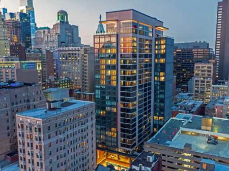
Developers maximized the site’s density by avoiding the costs of creating underground parking since the project’s zoning approval included an agreement to provide up to 104 parking spaces for lease in the adjacent seven-level, 600-space Parkway Corporation garage. The tower also benefits from views across the lower structure and from rooftop terraces on the 25th floor. (Design Collective)
Opened Base
While residents can experience increased light and air that come with carving the floor plate, Philadelphia’s urban dwellers typically perceive only the first 30 feet (9 m) of building height due to the tight Walnut and Sansom street sections.
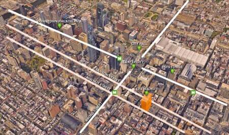
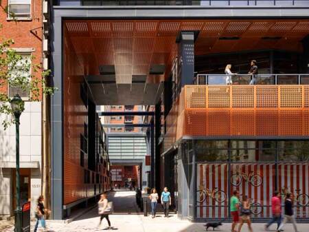
On Walnut Street, the tower’s immediate neighbors are three- and four-story historic brick townhouses. Design Collective designed a base volume to match the height of the adjacent townhouses to the west and a seven-level parking garage to the east. They punctured that volume with a 35-foot-tall (11 m), 25-foot-wide (8 m) open passageway that runs through to Sansom Street, a one-way street filled with restaurants, bars, and artists’ studios that is barely wide enough to accommodate two lanes.
On the Sansom Street facade, the design envelops the historic two-story Fergie’s Pub, but above it the tower is set back about 50 feet (15 m) from the street to the third floor. A two-story, glass-walled retail space measuring only 20 feet (6 m) wide but 50 feet (15 m) long along the passageway matches the scale of Fergie’s Pub, but with its glass walls and terrace, it is as open to the urban space as the historic pub is removed from it.
To open the Walnut Street facade even more, Design Collective recessed a second-level outdoor public terrace, which the team calls its front porch, which is defined by a horizontal band of perforated rust-colored metal panels topped by a clear glass railing. Below that are 16-foot-tall (5 m) floor-to-ceiling glass storefronts.
The visual effect of the tall, open, through-block passageway; glass streetfront wall; and recessed second-floor open terrace is to raise the tower so that it appears to float above its more open base like a proscenium arch with its visual depth both receding and advancing in contrast to the solid volumes of the surrounding buildings. Those effects are magnified by lighting the horizontal band of perforated metal panels, the vertical wall of the passageway, and the ceiling of the entire base, all made of the same material that glows in red or yellow tones depending on the angles of the surfaces and the ambient lighting. The open and lighted recessed building base appears to lift the visible mass of the tower’s 23 apartment floors above the street in a way that is compatible with its more distant neighbors.
Through-block Woonerf and Porte Cochère
Design Collective was able to move the apartment entry to midblock in the center of the passageway, which functions as a woonerf, a narrow, curbless street that serves pedestrians and vehicles equally. Placing the entry at the center uses the least-rentable interior space and allows the full length of the Walnut Street storefronts to be leased, thereby increasing long-term economic value.
The one-way woonerf allows taxi and ride-share vehicles to stop under a protected roof while loading and unloading passengers and then to continue north to exit to Sansom Street. Since the woonerf extends 225 feet (69 m), it can accommodate as many as 22 vehicles. The woonerf therefore becomes a midblock porte cochère, creating a hotel-style entrance that allows ride-hailing vehicles and taxis, as well as short-term delivery trucks like UPS and Instacart, to serve residents without tying up the street. As food deliveries increase in popularity in dense urban areas, this can be an important provision. To further accommodate such deliveries, a separate package room with refrigerated space off the lobby enables an attendant to hold goods and groceries delivered to residents.
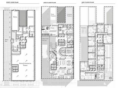
Placing the entry at the center of the midblock woonerf uses the least-rentable interior space and allows the full length of the Walnut Street storefronts to be leased. Open terraces on both ends of the second floor bracket active and quiet public spaces for residents. A fitness center bridges the woonerf. A Z-shaped double-loaded corridor allows for three more apartments at each end of the northeast and southwest corners that either overlook the city or the east and west 100-foot-long (30 m) outdoor terraces. That Z-shape plan creates larger corner units with skyline views that become the most desirable units. (Design Collective)
Perhaps unwittingly, the porte cochère might also make 1213 Walnut particularly desirable for the new trend for apartment buildings to convert some or all of their units for hotel uses. [See “The Rise of Pop-up Hotels,” W.P. Macht, Urban Land, Fall 2019, pp. 240–246.] And since portes cochères are becoming popular again in Manhattan condominiums, this project might become attractive for later condo conversion. [See “A Revived Relic Hides the Wealthy from Prying Eyes,” J. Barron, New York Times, December 25, 2019, Sec. A, p. 20.] A loading entry on Sansom Street, separate from the woonerf, is used for residents’ move-ins and move-outs.
Midblock Entry
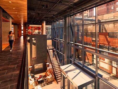
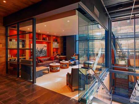
The midblock entry is a two- to three-level space with a 35-foot-tall (11 m) glass wall admitting light from the southwest. That creates a grand, hotel-like lobby with comfortable seating, a concierge reception station, and an open staircase leading to a balcony overlooking the lobby and leading to a 3,000-square-foot (279 sq m) indoor/outdoor fitness center with yoga terrace at one end, and to a quiet library and entertainment room. Just beyond that space is a café/lounge that in turn leads to the outdoor terrace overlooking Walnut Street.
Just past the midblock entry, a translucent-glazed bridge spans the woonerf. It houses the fitness center that illuminates the woonerf at night, adding visual interest to the passageway and creating views for the residents as they exercise. The translucency lends some privacy to the residents while the shadows through the glass lend activity to the woonerf and street. Gaming and quiet rooms are adjacent to the café/lounge. A separate lounge in the southeast corner of the third floor, which is rentable for private parties, adjoins the outdoor terrace.
Open Terraces
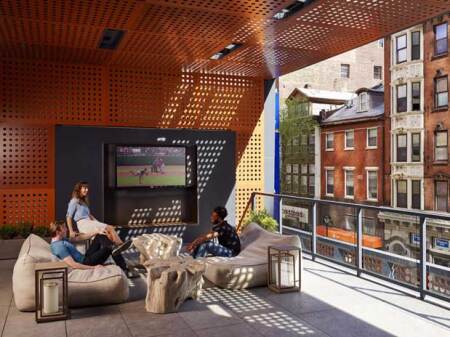
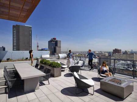
Design Collective’s landscape architects took advantage of the Z-shaped floor plate to create four of the outdoor terraces on the east and west sides of the third and 25th floors. The 25th-floor rooftop terrace is fitted with grills, televisions, a private dog park, and a lounge with a catering kitchen and a two-sided fireplace.
The purpose of these design interventions is not merely architectural but also economically driven. The developers sought to create an active urban environment that would attract millennials seeking an urban lifestyle without the need for an automobile. They also wanted to attract empty nesters looking to relocate to an urbane tower without the burden of home maintenance or condo association complications.
No Internal Parking
The developers were able to maximize site density by avoiding the costs of underground parking, or the sacrifice of leasable space to above-ground parking. There is no internal parking at 1213 Walnut. Instead, incorporated into the project’s zoning approval is a requirement to provide up to 104 parking spaces for lease in the adjacent seven-level, 600-space Parkway Corporation garage at 12th and Walnut. The 172 spaces that would have been required by the underlying C-5 zone were reduced to 104 provisional spaces under the garage agreement yielding a 0.32 parking ratio.
Since car-owning residents pay market rates for parking, the parking-free high-rise encourages residents to use mass transit, reducing construction costs for the developers. “In these downtown environments, reducing or eliminating parking has multiple benefits,” says Al Hedin, then the project director for Hines and now a vice president at Brookfield Properties. “And as self-driving cars and ride sharing start to prevail, car ownership will continue to decline,” he says. The building also contains 209 interior bicycle parking spaces.
Smaller Units
The large amount, and variety, of resident amenity spaces at 1213 Walnut allowed developers to create a unit mix with an abundance of smaller units, achieving an average unit size of just over 657 net rentable square feet (61 sq m). However, a shallow depth of about 22 feet (7 m) and the floor-to-ceiling glass walls make the apartments feel larger.
About 77 percent of the units are smaller than two-bedroom units. Fourteen percent are studios averaging 439 square feet (41 sq m); 27 percent are junior one-bedrooms averaging 554 square feet (51 sq m); 28 percent are one-bedrooms averaging 651 square feet (60 sq m); eight percent are one-bedrooms plus den averaging 791 square feet (73 sq m); and 23 percent are two-bedroom units averaging 881 square feet (82 sq m).
At the beginning of 2020, advertised rents ranged from $1,930 to $4,066 per month and roughly 11 percent of the units were available to rent. The project is managed by Greenbelt, Maryland–based Bozzuto Management Company.
Studio units have a separation between living and sleeping areas and floor-to-ceiling glass walls for both areas. Use of two glazing types permitted such windows while maintaining enough energy efficiency to achieve Silver certification under the Leadership in Energy and Environmental Design (LEED) rating system devised by the U.S. Green Building Council (USGBC). One-bedroom units add walk-in closets or a den. Most two-bedroom units place the bedrooms on opposite sides of the living area for roommate and guest privacy, and many offer dual master bedrooms. Penthouse units add dens and powder rooms.
Sometimes in the course of urban development, the greater the number of constraints, the more innovative the solutions that can be devised to meet the challenges they present. Projects that are successful both for architects and developers need to integrate all the solutions seamlessly, as both strove to do on this project.
WILLIAM P. MACHT is a professor of urban planning and development at the Center for Real Estate at Portland State University in Oregon and a development consultant. (Comments about projects profiled in this column, as well as proposals for future profiles, should be directed to the author at [email protected].)

