A Washington, D.C.–area developer builds a high-amenity, low-rise courtyard project to knit together a more urban, transit-oriented housing community.
In America’s suburbs—which lack the finer-grained, gridded block pattern of their urban counterparts to help stitch buildings into an urban fabric—developers must marshal all their resources to help define a sense of place for their projects. In its work for client Bethesda, Maryland–based developer LCOR, Baltimore-based architecture firm Design Collective formulated urban design strategies for the multiple-building residential development North Bethesda Center that illustrate a disciplinary, multipronged approach.
North Bethesda Center is the result of efforts by the Washington Metropolitan Area Transit Authority (WMATA) to increase density on sites it had acquired and retained along its Metro rail system’s Red Line, which runs about 15 miles (24 km) northeast from the capital. On land owned by WMATA, LCOR had previously ground-leased and developed two concrete high-rise residential towers. Wentworth House is a 17-story tower with 312 housing units above a 63,000-square-foot (5,900 sq m) Harris Teeter full-line supermarket, a Walgreens pharmacy, and a Starbucks coffee shop. Just east of Wentworth, LCOR built the 341-unit, 18-story Aurora tower.
There remained a 2.5-acre (1 ha) Parcel G, later to be called Arrowwood, immediately east of WMATA’s six-level, 1,270-space White Flint Metro station parking garage. All of these sites are part of a 16-acre (6.5 ha) superblock. LCOR and Design Collective are developing the final three-acre (1.2 ha) residential lot immediately east of Arrowwood.
Even though the scale of the superblock was large and the level of LCOR’s development and investment was substantial, it would be necessary to formulate strategies that work together to create a place where people would want to live and were willing to pay rents sufficient to cover the developer’s investment. Some of the strategies the development team formulated to accomplish those goals follow.
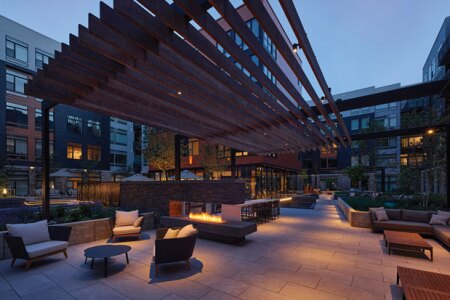
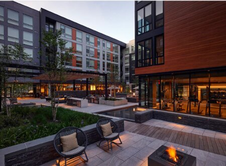
A raised, cantilevered firepit wall defines different seating areas, many flanked by long outdoor sofas. Raised concrete planter beds help define other seating areas. Rainwater from high roofs passes through a series of custom manifolds that dissipate water energy and distribute water into the planters. (Design Collective Inc.)
Unify the Projects
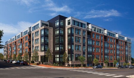
Arrowwood originally had been approved in the North Bethesda Center master plan as a high-rise structure, says Mike Goodwin, Design Collective managing principal, but when the market was shifting in 2017, the developer decided on a wood-frame building to meet the rising costs of construction. A wood-framed, low-rise building might be seen as one of lesser quality and unrelated to the two towers. But to the extent that the three buildings could be interrelated, their collective impact could be maximized, thereby leveling any qualitative differences. Because all three were planned, developed, owned, and operated by the same entity, which is uncommon in existing urban settings where three contiguously owned blocks are rare, Arrowwood could share retail space, a pool, and leasing amenities with its neighbors, removing the need and cost to replicate such programmatic elements.
When the first two towers were built, LCOR developed a central urban park block, called McGrath Green, surrounded by a one-way, tree-lined drive loop with a row of parallel parking along it. Entrances to both towers adjoin the north side of the urban park. If the entrance to Arrowwood could adjoin the south side of the park, that could take advantage of the park and give it an edge that helps form a more urban place.
Maximize the Site
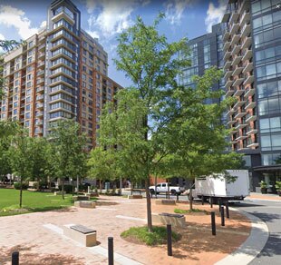
When the first two towers were built, LCOR developed a central urban park block, called McGrath Green, surrounded by a one-way, tree-lined drive loop. Entrances to both towers adjoin the north side of the urban park. Because the entry to the towers was on the park, the new project would also need to be at the higher north end of the site. A shared pool is located at its eastern edge. (Design Collective Inc.)
The 2.5-acre (1 ha) Parcel G site could physically house another large tower, but that would require load-bearing steel stud or all-concrete construction, which entails construction cost premiums. Because it was opposite the six-level WMATA parking structure and across from the WMATA bus maintenance facility, higher rents would be harder to achieve. The two existing towers had been sited at the crest of a ridge that slopes both north and south over 20 feet (6 m) in elevation.
The slope away from the towers would make it more difficult to relate the new project to the towers and to the park. And if the building was to be low- or mid-rise to reduce project costs, it would be more difficult to use height to connect the three buildings.
Furthermore, because the entry to the towers was on the park, that meant the new project would also need to be at the higher north end of the site. But in those very real impediments of topography and building type lay the solution for Arrowwood.
Extend the Grade Level
Design Collective could maximize the site by extending the park grade level over the whole site with a concrete podium, then extend the building site to its perimeter to enclose the largest inner courtyard commons, thereby visually expanding both the new inner park and the external urban park through transparent connections. Making the podium flush with the park’s elevation enabled the largest possible five-story wood-framed construction above, thereby matching the 294-unit count approved for a high-rise tower on the site.
This approach maximized the number of units with controlled views of the inner courtyard, providing at-grade units with direct access to private and public outdoor space. The podium lid over the parking also made it possible to develop richly varied outdoor gardens onto which all the interior units can look. Because the inner park is about 160 by 120 feet (49 by 37 m), it is large enough to create longer-than-customary distances between courtyard apartments, allowing greater privacy, daylight, and air circulation.
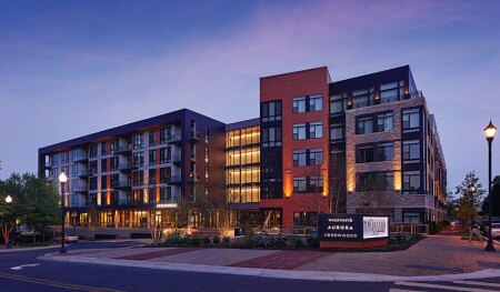
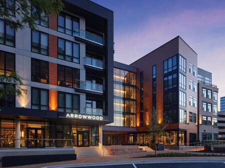
The entry portal defines the interplay between the public and private realm, framed by a four-story glass bridge providing urban views from the elevator lobbies above. Floor-to-ceiling glass extends the full length of the clubhouse as a kind of covered porch facing the urban park. (Design Collective Inc.)
Bury and Wrap Parking
The advantages of this solution are far more than aesthetic. A podium built at park grade level allowed all the parking to be concealed beneath it. Because the site slopes sharply to the south, constructing below-grade parking required far less excavation, the main factor driving the cost premium for underground parking.
The project provides 344 spaces on two separate flat levels below the podium. Rather than expose the parking structure as the slope declines, Design Collective chose to wrap it with walk-up stoop units. Though that is not as efficient as a double-loaded apartment corridor (two units accessed by a single hall corridor), only six units of that description are located below the podium. Interior bike parking is immediately adjacent to the bike lane on an adjoining street.
Make Elements Transparent
In order to make the extended grade level truly functional, Design Collective executed several strategies to make the major elements transparent. The 50-foot-wide (15 m) entrance plaza splays outward, anchored by a three-seating-level public stoop functioning as an amphitheater for community engagement, with the seating and steps leading up to a recessed passageway to the inner courtyard.
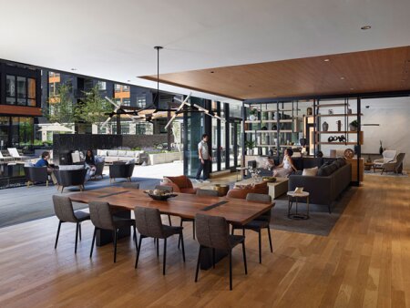
This portal defines the interplay between the public and private realms, framed by a four-story glass bridge providing urban views from the elevator lobbies above. The clubhouse has floor-to-ceiling glass that extends its full 150-foot (46 m) length as a kind of covered porch facing the urban park. The opposite wall of the 65-foot-wide (20 m) clubhouse, which faces the inner courtyard commons, is also sheathed with floor-to-ceiling glass, with a large portion that slides open to enable parties and other events to flow into and out of the courtyard.
A 40-by-70-foot (12 by 21 m) fitness, health, and wellness center wing juts into the inner courtyard with four stories of housing above it. To prevent the mass of this peninsula from shrinking the perceived size of the courtyard, three sides of the fitness center are also sheathed with floor-to-ceiling glass. A sunken fountain and reflecting pool on three of its sides highlight the activity and space inside the fitness center. The placement of the facility and a diagonal boardwalk focuses the eye along a continual 230-foot-long (70 m) axis from the edge of the northern entrance southeast to the southern edge of the inner courtyard.
Articulate Garden Rooms
The landscape team at Design Collective uses a variety of level changes to introduce what it calls garden rooms within the inner courtyard.
A raised wooden seating platform with umbrella tables projects over a large fountain pool with water continually flowing over the rounded edges of its granite enclosure. A raised cantilevered firepit wall defines different seating areas, many flanked by long outdoor sofas. Raised concrete planter beds help define other seating areas. Rainwater from high roofs passes through a series of custom manifolds that dissipate water energy and distribute water into these planters. Multiple steel post-and-beam trellises with wooden slats articulate separate gathering places and barbecue areas.
The combined effect of these various strategies is to create outdoor living rooms flexible enough to accommodate many groups at different times and under diverse weather conditions.
Minimize Construction Costs . . .
The first two parcels had been built as concrete towers to achieve the highest rents. Goodwin notes that wood-framed construction could result in about a 40 percent cost reduction. The building codes allow a maximum of five stories of wood construction above a concrete podium that could cover a maximum of three stories, as long as the distance from the lowest point of fire department access to the highest occupiable floor level is less than 75 feet (23 ha).
On this sloping 2.5-acre (1 ha) site, Design Collective’s plan yields 294 units, which equates to 118 units per acre (264 per ha). While the two towers’ density on individual sites is over 200 units per acre (494 per ha), when the Harris Teeter grocery and parking are included, as well as the urban park entry sites, density drops to only 108 units per acre (264 per ha). That means this low-rise structure could match the actual density and 300-unit average scale per building of the existing high-rise projects.
. . . But Maintain Rents
Developers must think not only about construction costs, but also about revenue streams. A lower-quality project might depress rents for the towers. But if the low-rise project could attract tenants at unit sizes and rents comparable to those of the towers, then it could justify some construction cost additions such as those for the higher-quality inner courtyard and public spaces that had been designed.
Current data suggest that rent levels are comparable in all three projects. This past winter, Arrowwood achieved rents of $1,945 to $3,505 for units of 565 to 1,191 square feet (53 to 111 sq m). Many of its two-bedroom units have a central living/dining area and kitchen that is flanked by dual master bedrooms, each of which has a walk-in closet that leads to a private bathroom. At the same time, Wentworth House realized rents of $1,605 to $2,968 for units of 563 to 1,250 square feet (52 to 116 sq m), and Aurora rents ranged from $1,715 to $3,505 for units of 493 to 1,160 square feet (46 to 108 sq m).
The unit mix of Arrowwood includes 52 studios (18 percent), 130 one-bedroom units (44 percent), and 112 two-bedroom units (38 percent). More granular data regarding unit mix, term, turnover rates, and vacancies not available publicly might suggest different performance characteristics of low-rise versus high-rise buildings, so the similar range and unit sizes of the three projects could be misleading. But the fact that those ranges are so similar demonstrates that Arrowwood is perceived by the market to be competitive.
The reason, says Design Collective principal Nick Mansperger: “It’s the building’s common areas and units’ direct adjacency to highly designed and diverse landscaped spaces that differentiate it from high-rise living that’s often segregated from the ground and segregated from seeing your neighbors.” Business news articles in March 2019 reported that LCOR had received a construction loan from M&T Bank for a $90 million project, which equates to $306,000 per unit. Those costs are not dissimilar from other units of higher quality.
Arrowwood’s large communal outdoor commons spaces, visible to its residents and accessible to all tower residents, help build community. The variety in outdoor spaces from the urban park to the inner courtyard commons provides various facilities—from largely open areas to more intimate outdoor spaces—for use by residents of all three projects. This suggests that, together, they do help define a more urban sense of place for this suburban project.
The availability on site of a large full-service grocer—as well as access to Metro’s regional rail station by a short walk of less than 1,000 feet (305 m) and to the Pike & Rose entertainment and restaurant offerings less than a half-mile (0.8 km) walk away—creates a much more urban experience than is typical in suburban locations. In addition, LCOR’s common ownership and management of the varied facilities in all three projects helps create a more enticing place to live. The additional thousand units the buildings add to the area’s high-quality housing stock also help fulfill the objectives of WMATA’s joint development program begun over three decades ago.
(Editor’s note: This marks the last column from Will Macht following 20 years of excellent contributions and industry insight. He will be missed. Here are some of his most popular contributions.)

