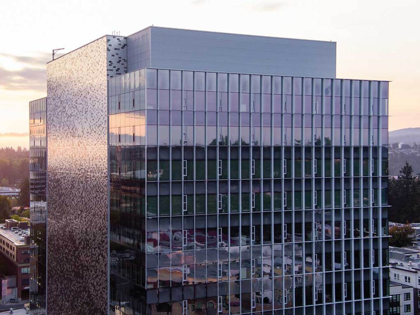
West Main, a 1,030,000-square-foot (95,690 sq m) office, retail, and mixed-use project, is the new home to some of Amazon’s 12,000-person workforce in Bellevue, Washington. The three-building project, designed by Graphite Design Group in collaboration with Compton Design Office for Vulcan Real Estate, is transforming this city neighboring Seattle to the east.
Before West Main was completed in January 2024, the cityscape surrounding the site disrupted any connection between Old Bellevue and downtown. The creation of West Main changed that: it revitalized Main Street by using interactive art and landscaping to capture passersby. West Main’s facade and courtyard attracted such tenants as world-renowned Peruvian restaurant La Mar Cebichería Peruana, opening its third location in the U.S.—its eighth worldwide.
West Main is positioned as a focal point in Bellevue’s evolving urban landscape, skillfully facilitated through strategic street-level landscaping, interactive art, and the implementation of accessible pedestrian-friendly exteriors.
The project’s three fully leased towers, home to a mix of uses and hospitality brands, are just the beginning as Bellevue grapples with the challenges of rapid growth. West Main serves as a model for how cities can evolve without losing their identities, and create spaces that prioritize people over profits.
A people’s place
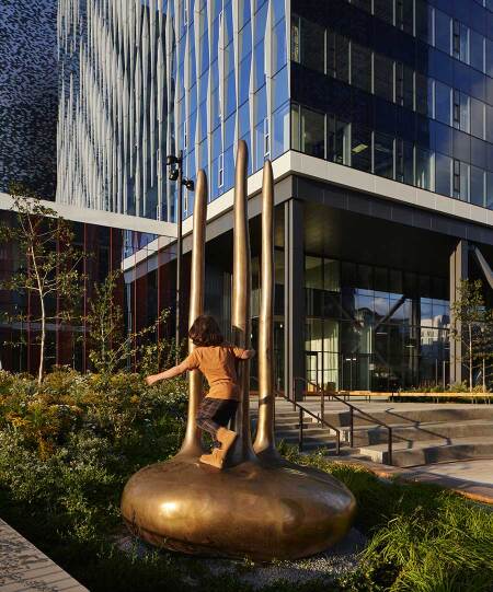
Expert landscaping of the West Main campus plays a major role in enriching the public areas at ground level. West Main features 80,000 square feet (7,432 sq m) of open space and a public plaza, a stunning integration of art and landscape, designed by award-winning landscape architecture firm GGN.
Vulcan Real Estate, the project’s developer, frequently commissions local artists in its projects. For West Main it selected emerging talents Julian Watts and Iván Carmona for their unique perspectives and abilities to capture the essence of the Pacific Northwest.
Watts created Groves and Stones, a carefully curated multipiece installation inspired by the Pacific Northwest’s boulders, mountains, and trees. Guided by the buildings’ features, the soft, organic forms beautifully complement the crisp edges, seamlessly integrating with the angular architecture. The resulting artworks are meant to be touched, stepped on, and sat upon, offering a tactile connection to the natural world amid the urban setting.
Carmona’s bold red sculpture De Sol a Sol (From Sunrise to Sunset) greets all who enter the courtyard. As the artist explains, it pays homage to the Jíbaro, the contemporary stewards of Puerto Rico’s agricultural traditions. These dedicated farmers work their land from dawn until dusk, cultivating crops in the timeless manner of their forebears.
Informed by Graphite’s close collaboration with GGN and Compton Design Office, the courtyard creates a strong frame uniting the three towers and connects to the surrounding neighborhoods with design that’s cohesive, fluid, and engaging. Vibrant native meadow plants reassert the region’s ecological character in the heart of downtown.
With the recent opening of the East Main Light Rail station in Bellevue, West Main’s attractions are more accessible than ever. Now, the wider community can enjoy the art and amenities of West Main, thus fostering a sense of ownership and belonging.
Bringing Seattle’s downtown to the Eastside
West Main was the beneficiary of previous urban revitalization projects between Graphite Design Group and Vulcan Real Estate, including the Denny Regrade in Seattle, which turned a once-sleepy neighborhood into a vibrant extension of South Lake Union.
Over the last decade, Graphite and Vulcan have worked together to design and develop more than 10 buildings for tech giants Amazon and Google, comprising 2,000,000 square feet (185,806 sq m) of premium office space in downtown Seattle.
This effort has significantly transformed the Denny Regrade neighborhood and the adjacent South Lake Union community, attracting residents and businesses to Seattle’s urban core. By focusing on resource conservation, transportation synergies, lifestyle benefits, and long-term flexibility, the design and development teams were able to create a mini-city within the city.
Graphite designed West Main with this same overarching objective: ensuring that the street level of the complex engages with the local community through business, art, and landscape, effectively expanding Bellevue’s western limits. This commitment is evident in the array of big-name retailers who’ve come to West Main, drawn by its energetic atmosphere and innovative design. As Bellevue continues to evolve, West Main stands as a beacon of progress, creating a space where the greater community is able to come together to live, work, and enjoy all that city life has to offer.
Meydenbauer Creek
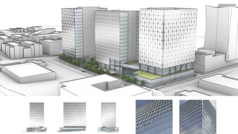
Inspired by the historical Meydenbauer Creek that once flowed through the site, the design team sought to incorporate elements of those currents into West Main’s facades. The result is a subtle yet striking pattern that ebbs and flows across the towers to lend a sense of movement and rhythm. Yet each one is unique. Although the design sought to emphasize visual cohesion among the three buildings, variations in patterns give each tower its own distinct appearance, designated as “Push-Pull,” “Weave,” and “Tuft.”
The flow pattern was mapped onto the glass itself by using parametric modeling and digital printing technology to deploy a continuous pattern over individual glass panels on each street-facing façade. The towers’ composition further emphasizes the cohesiveness of the site by emphasizing two distinct classes of façades: ones looking outward, the City Faces, and ones overlooking the courtyard, the Inside Faces.
Tower 1: “Push-Pull”
Fins of varying depths appear in a graduated pattern, framing one side and the top of each unit, to create a fluid wave pattern across the City Faces. Fin depths change no more than one inch from one to the next, creating a smooth-flowing pattern.
Tower 2: “Weave”
City Faces are cloaked with vertical fins that extend the full height of each floor, each with a slightly different depth and angular projection. Like Tower 1, transitions are stepped in one-inch increments to ensure a fluid appearance.
Tower 3: “Tuft”
Similar to Towers 1 and 2, graduated, angular fin projections are used in a cruciform arrangement, each meeting at the high point to create a unique peaked pattern reminiscent of tufts in sewing.


