The design quality of affordable housing can have a substantial positive effect on both residents and the surrounding community. Good design uplifts residents, helping strengthen social connections, relieve stress, and enhance a sense of safety and belonging. It also can help repair blighted areas, raise adjacent property values, and attract market-rate development.
A successful new building creates a sense of authenticity and uniqueness in the urban environment, giving people a place where they can feel at home and more effectively engage with the world. This does not have to add to the project’s costs. The following are design strategies that can enhance any housing, whether affordable or market rate.
1. Think Outside the Property Line
A building’s presence does not end at the property line, but instead plays an integral part in the surrounding neighborhood. An understanding of the orientation and nature of the nearby urban typologies is key—for instance, enabling the design team to orient views strategically, perhaps to a nearby landmark or public park, “borrowing” green space in the urban environment. Something as simple as giving passersby glimpses into an interior courtyard or placing the door to the community room on the street can make the pedestrian realm a better place for residents and neighbors alike.
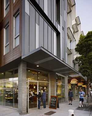
Windows that overlook the street and residential entries can enhance safety, while wide sidewalks with plantings greatly improve the pedestrian experience and can aid in stormwater management. New housing can double as an amenity for the community by having a large ground floor offering neighborhood-serving retail space.
When adding affordable housing to neighborhoods where no one walks, architects and city planners may find it counterintuitive to try to engage pedestrians. However, it is their responsibility to recognize the power of a development to transform an area.
2. Remember That Low Fences Make Good Neighbors
The impulse often is to surround low-income housing with a fence to give residents or neighbors a sense of safety. Though security concerns are understandable, this approach can backfire, making the streets feel more dangerous.
Tassafaronga Village in Oakland, California, a public housing project that had significantly deteriorated since its construction in the 1950s, was surrounded by abandoned industrial uses, unused train tracks, single-family residences, and a crime-ridden city park. When the Oakland Housing Authority decided to replace the complex, the question of fencing arose. The Parks and Recreation
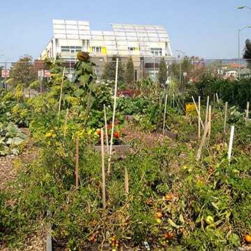
Department’s standard called for tall fences separating housing from parks, but the design team successfully argued for eliminating the fencing around the property and having only a low fence with gates at the park so residents could feel a sense of connection to and pride in the park. The new neighborhood increased safety at the park, which in turn led to creation of a community farm that directly benefits the residents. The refreshed village opened in 2010, and the Oakland Police Department in 2012 reported a 25 percent drop in crime at the site from five years earlier.
3. Reweave the Urban Fabric
Affordable housing projects frequently are isolated from the rest of the city, and new development has often turned its back on these buildings. A better idea is to knit affordable housing into the urban fabric so residents have access to transportation, jobs, and all community resources.
At Tassafaronga Village, many of the streets are owned by the Oakland Housing Authority. In the previous iteration, there was a clear distinction between the public and private streets; rolling gates segregated the community from the neighborhood. The redesigned Tassafaronga treats all the streets the same, whether private or public, and creates connections among isolated neighborhood resources.
4. Build the Bones
When designing affordable housing, focus on the massing of the building—the sculptural arrangement of the structure. If the design relies too heavily on costly materials, the design intent may be lost if those materials are downgraded for savings. Much of a building’s contribution to the urban realm happens with the massing.
Bayview Hill Gardens in San Francisco—73 supportive units for formerly homeless families—is a relatively large building compared with the surrounding residential neighborhood, and its site is steeply sloped. Over the course of the design development, several changes were made in the materials palette, but the massing was retained throughout. The building is broken into several smaller volumes that step down the hill and complement the surrounding structures. Changes in the facade increase articulation, but the design succeeds largely because of its sculptural form.
5. Be Welcoming
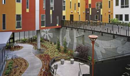
Using green space at the entry is highly effective. Biophilic courtyard entries set an inviting and peaceful tone for the building and serve as a decompression space where residents can relax as they make the transition from the street to their units.
At Station Center in Union City, California, which includes 157 affordable rental units, residents reach their units by passing along a retail corridor and through an archway portal into a semipublic courtyard. The courtyard is adjacent to a plaza with a play yard, seating areas, and the development’s swimming pool. Placing the entrances in the courtyard with the amenities encourages casual interaction and allows people to sit and relax on their way in or out.
6. Cultivate Community
A strong relationship between community rooms and green space is important. Ensuring that the development provides views from public spaces and circulation areas into a courtyard or lounge can encourage social interaction and help residents feel as though they are part of the community. Physical connections between community rooms and courtyards create space for large events to spill outside.
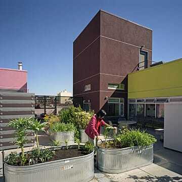
Incorporating urban agriculture into a development can have powerful therapeutic and symbolic value. While giving residents the option of having an individual garden allotment is one possibility, a new trend is for a nonprofit association to manage the gardens and support the participating residents while ensuring that no plots become neglected.
7. Create Synergies
Placing complementary uses adjacent to each other or providing views from one to another can create beneficial synergies. Laundry rooms and mail rooms, in particular, pair well with other active uses; they should not be sequestered in a basement or other out-of-the-way space. Placing such facilities at ground level with plenty of natural light and near gardens, children’s play structures, or community rooms builds on the social power of everyday spaces. Residents doing laundry can sit in the garden or pull weeds from a vegetable bed while the wash cycle finishes, or they can keep an eye on kids at play while folding clothes.
8. Address Circulation
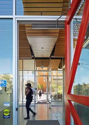
Staircases and corridors should be given careful consideration during design. At least one open-air staircase should be placed near the entrance, preferably with plantings; at the least, it should have plenty of natural light. Stairs often lack windows, are left unpainted, and are restricted to emergency use, leaving the elevator as the default method to get from floor to floor. An appealing stairway that is convenient to use encourages people to walk instead of riding the elevator, thereby taking a healthier and more social route.
Corridors should be pleasant places as well and have natural light from at least one source. Articulating the corridor through recesses, offsets, door groupings, or color choices adds variety, helps with wayfinding, and creates a sense of community. Large landings near elevators or laundry rooms and pop-out bays with seating provide opportunities for socializing.
9. Provide Art for All
Incorporating artwork creates richness and a sense of place and authenticity. At Station Center, Union City’s percent-for-art program—a city program in which a fee (generally 1 percent of the project cost) is placed on large-scale developments to fund and install public art—enabled the design team to commission San Francisco artist Mona Caron to paint a large mural on the five-story entry tower, where it is visible throughout the neighborhood. At ground level, the mural has messages of welcome contributed in a variety of languages by the building’s residents, ensuring that the artwork feels unique to the project and helping build a sense of ownership in the development.
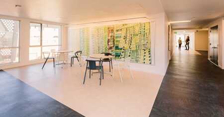
Though original art is wonderful, it can be expensive. One way to keep it affordable is to license imagery. For Bayview Hill Gardens, the artwork for the common space—a range of paintings and drawings by several artists—was licensed from Creativity Explored, a local nonprofit that gives developmentally disabled artists the means to create, exhibit, and sell their work. Because the imagery was reproduced, it was possible to enlarge the artwork up to three times its original size, which helped it fill the larger space. Another advantage of licensing is that if the artwork is damaged, a replacement can be printed.
10. Make Good Plans
It is best to design an entry space in each unit so that the front does not open directly into the living area or kitchen. Even in small units, an interstitial zone makes the entry more pleasant. One way to make room for such a space is to integrate the kitchen into the living space. A compact kitchen is sometimes the appropriate response in order to create an overall balance.
The same principle applies to windows. Though natural light and views are important, the sun can heat up small spaces quickly. Too many windows also can make it difficult for residents to place furniture against perimeter walls. Fine-tuning the amount of glazing for the size, proportion, and orientation of the room is essential.
Even in compact apartments, it is possible to make space for residents to have guests. A “nested” unit design, in which a junior one-bedroom unit interlocks with a neighboring one-bedroom unit, takes full advantage of the living area and creates room for a bed nook that separates the sleeping area from social space. At Folsom + Dore Supportive Apartments in San Francisco, a 98-unit building for tenants with special needs, such as physical and developmental disabilities, HIV/AIDS, and chronic homelessness, mezzanines added to the one-bedroom units on the top floor create a discrete space for a child’s room or a work area.
11. Get Personal
Many affordable housing developments serve populations that need extra support, such as seniors, formerly homeless individuals, or families struggling to make ends meet. There are many ways to create a moment of connection between residents that can then ripple out into the community.
At Armstrong Place Senior Housing, 116 units of affordable rental housing for seniors in the Bayview district of San Francisco, each unit has a small external “memory shelf” allowing residents to personalize their unit along the corridor. Residents have filled their shelves with such items as holiday decorations, artwork, and family photographs.
On a larger scale, design elements can be incorporated to reflect the residential population. Both Armstrong Place and Bayview Hill Gardens are filled with Afrocentric design elements and inspiration that represent the legacy of the historically African American neighborhood and its newest residents.
Creative use of space, careful attention to architectural detail, and thoughtful orchestration of street edges, open space, and common areas can make a huge difference in the experience and perception of a building. Ultimately, architects involved in creating affordable housing would do well to design residences that they themselves would want to call them home.
David Baker and Amit Price Patel are principals at David Baker Architects in San Francisco (www.dbarchitect.com), which designed the projects mentioned in this article.
Experience everything the Urban Land Institute offers! By joining ULI, you receive a free print edition of Urban Land Magazine, exclusive members-only content, significant discounts on events, workshops, and publications, and more.
Receive updates on similar articles from Urban Land magazine. Click here to sign up for our FREE weekly e-mail newsletter.

